Boots
Packaging Design
Brand Architecture
Styleguide Creation
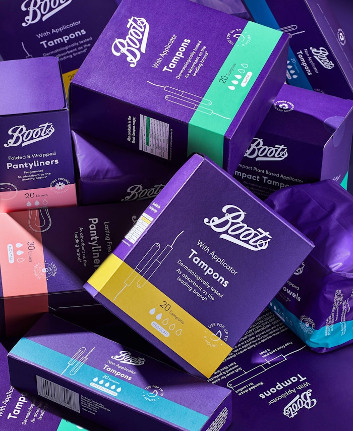
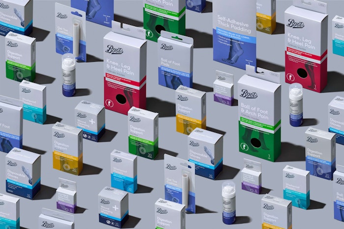
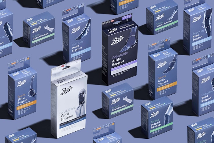
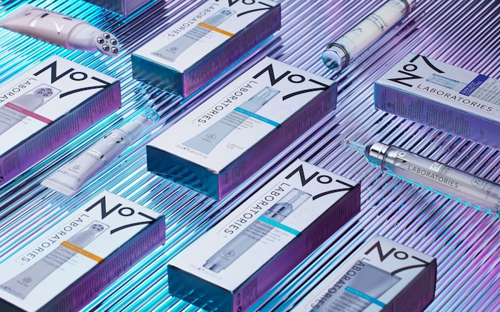
The UK's largest and most trusted chemist for over 170 years entrusted Two Create Studio to overhaul it’s entire range architecture; healthcare, beauty and personal care own label, Boots sub brands and brand alternatives as well as a brand new Everyday tier strategically introduced to combat hygiene poverty, challenge perceptions of the brand and counter competition from discounters.
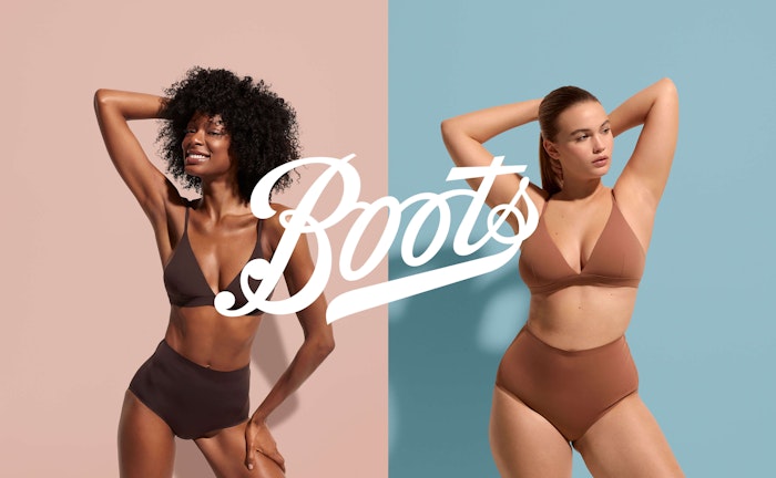
We designed a range of 8 looks to span the 9,000 products in the retailers own label, each developed to communicate the main product benefits within each category and value tier; be it the indulgence of a beauty treatment, the natural health benefits of a herbal remedy, the fun of a Kid's product or the efficacy of powerful painkillers.
Each look needed to communicate the semiotics of the category as well as represent the overarching brand identity with a uniting 'red thread’, running through every pack.
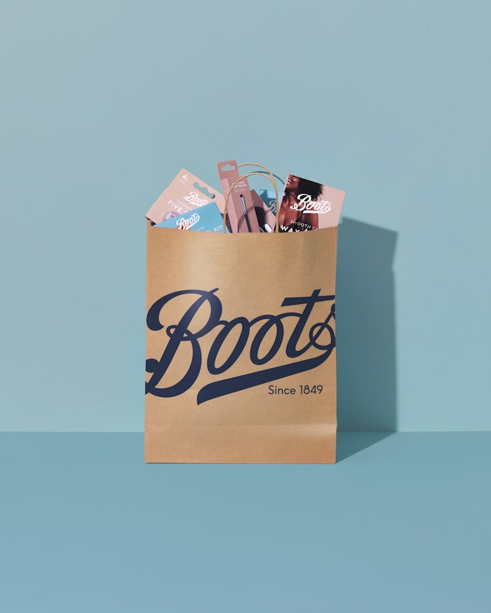
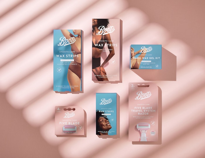
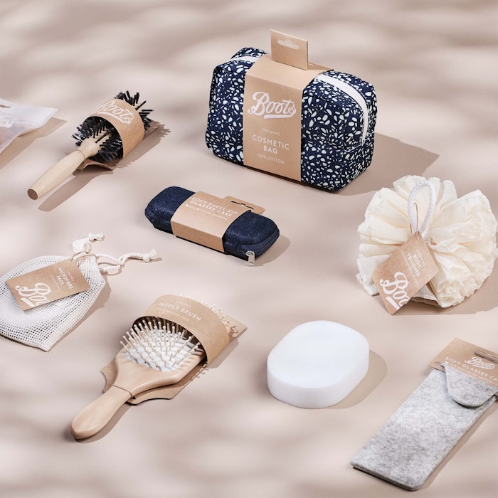
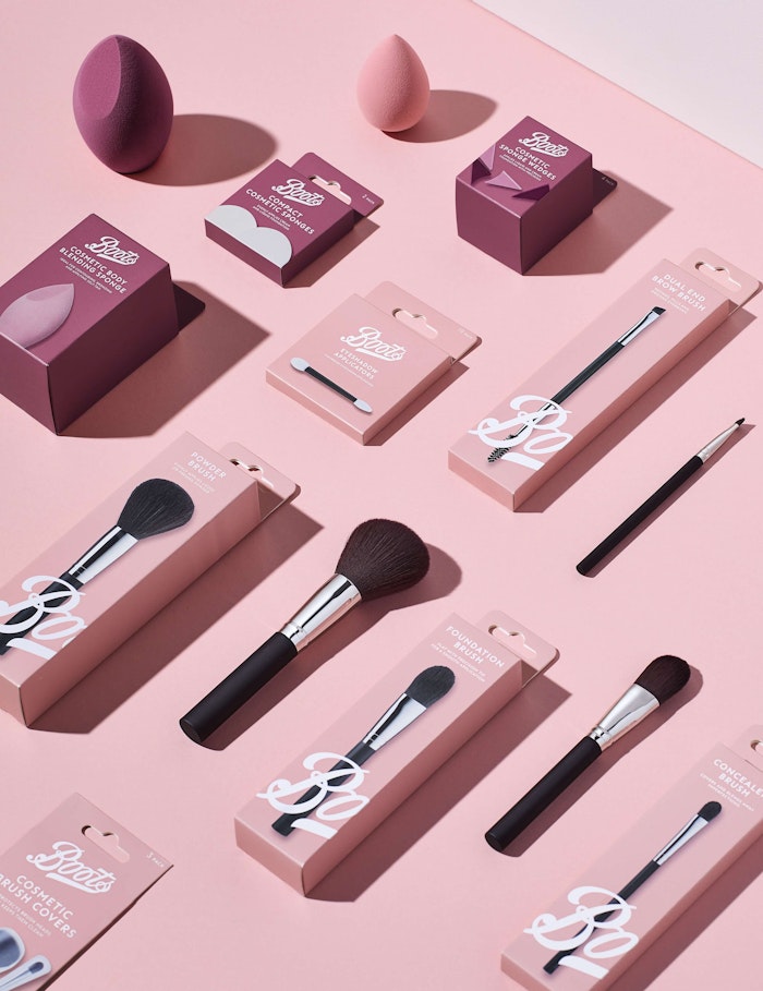
The result is a brand proud, consistent and coherent range of products, easier to shop and clearer to navigate. All non-recyclable materials have been removed, post consumer recycled materials introduced to a huge number of products and an overall 70% reduction in packaging materials has been implemented.
